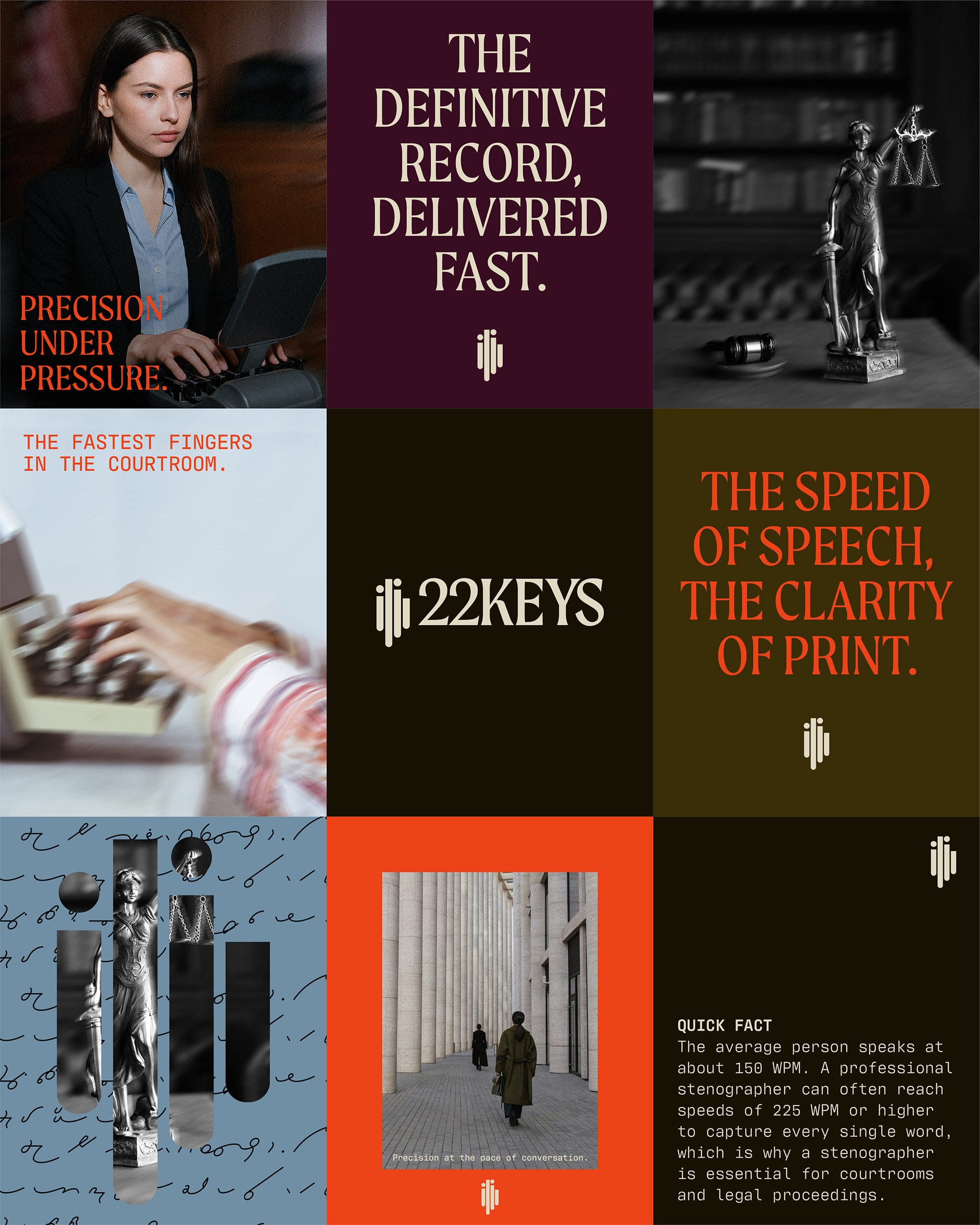
22 Keys represents the core of stenography: precision, speed, and clean, efficient communication. It stands for accuracy under pressure, mastery of rhythm, and the human intelligence behind every transcript.
Services
Brand Identity, Brand Assets
Agency
JYZ Design
I wanted the colour palette to feel dark and mature, reflecting the professionalism and seriousness of the work. Stenography is a discipline built on precision, focus, and integrity, so the deeper tones convey a sense of trust and authority. However, the vibrant red adds an eye-catching contrast—energetic and bold, much like the fast-paced nature of stenography. To convey this sense of movement, I incorporated motion blur into the imagery, highlighting the company’s key strengths: speed and accuracy. The taglines reinforce this message.
The scribble pattern draws inspiration from traditional shorthand writing systems such as Gregg and Pitman, paying homage to the origins of the profession before machine stenography became standard.
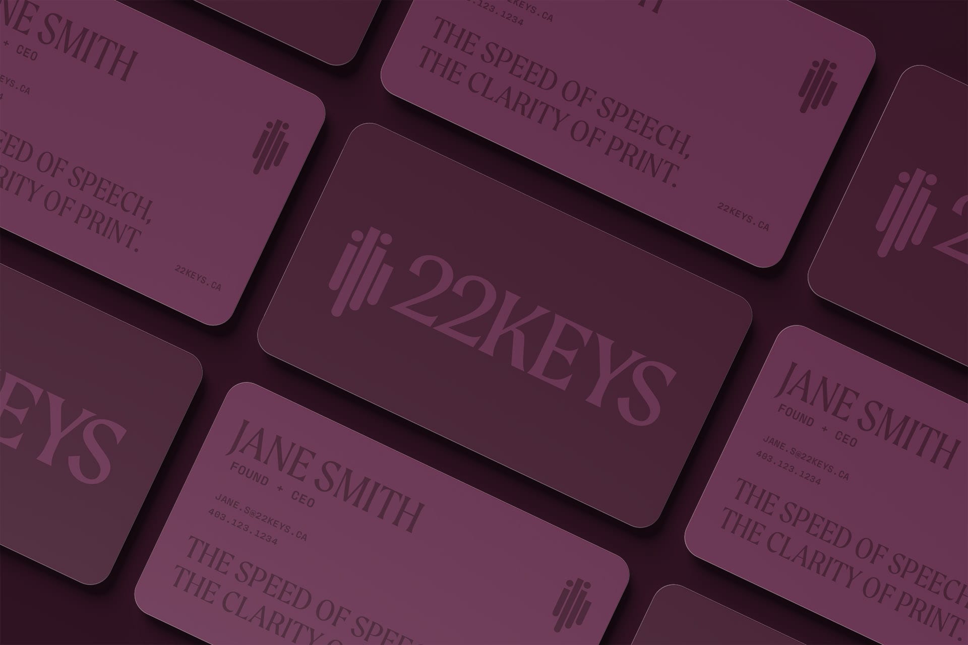
The logo draws inspiration from the interaction between two people in conversation, symbolizing genuine human communication at the heart of stenography. Its form references both the visual rhythm of an audio waveform and the distinctive shapes of stenography machine keys, blending human connection, sound, and technical precision. Unlike the cold precision of AI transcription, this design emphasizes the human touch—the intuition, speed, and understanding that only a real stenographer can bring.